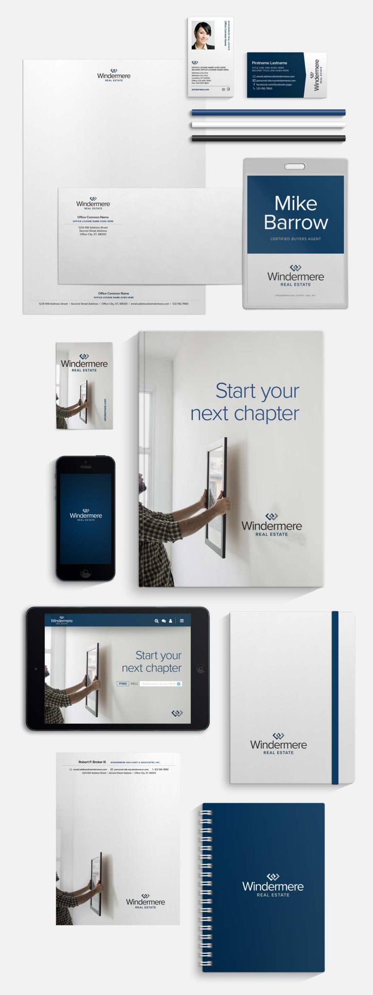
We hit the refresh button on the Windermere brand
slide vertical bar left and right to see before and after
logo evolution
The Windermere brand has been around for over four decades. We didn’t want to throw away all that valuable equity by starting from scratch, so we decided to just give it a more modern twist. This included a new icon with interlocking arms that symbolize the connections within the Windermere network and between our agents and their clients.
A family of icons
Through this process we didn’t want anyone feeling left out, so we went ahead and refreshed all of Windermere’s sub-brands, as well. From our Premier Properties luxury marketing program to the Windermere Foundation, the entire family of Windermere logos was given some much-needed TLC.
Windermere Real Estate
Windermere Commercial
Windermere Property Management
Premier Properties
Windermere Foundation
Endless
Possibilities
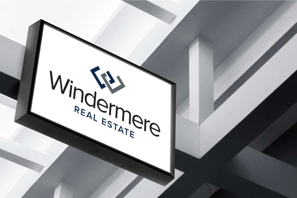
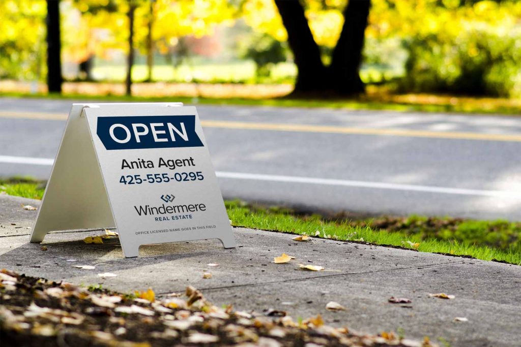
A sign of distinction
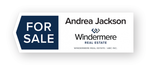
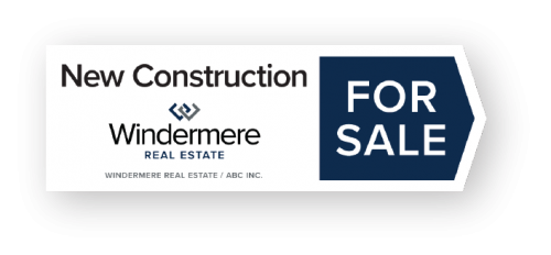
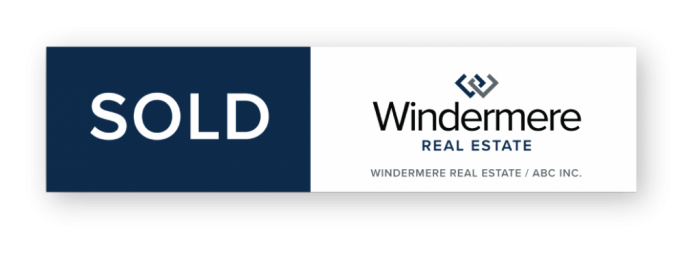
Technology has revolutionized the real estate search process, but the classic for sale sign is still one of the most effective marketing tools out there.
Program Branding
It takes a village of marketing programs and business divisions within Windermere to help make the machine run. Now each has its own individual identity that families with the overall Windermere brand.



New identity. Same philosophy.
We promise, the only thing that has changed is our look. The top-notch service and support buyers and sellers have come to expect from Windermere remains the same. But just like when you buy yourself a new outfit, don’t be surprised if our agents have a little more spring in their step.
